
Wickham Gray Interior Paint (I hate it and it’s perfect)
I’m going to start this post off with a controversial opinion. Are y’all ready? Here we go –
I hate gray.
Now I’ve never liked gray, but the gray trend over the last decade absolutely killed me. We took gray to the extreme and put it on everything, and it turned my dislike of gray into a true hatred. Take a look at the examples below. It’s easy to see that these are nice rooms that someone put a lot of time, money, thought, and effort into –
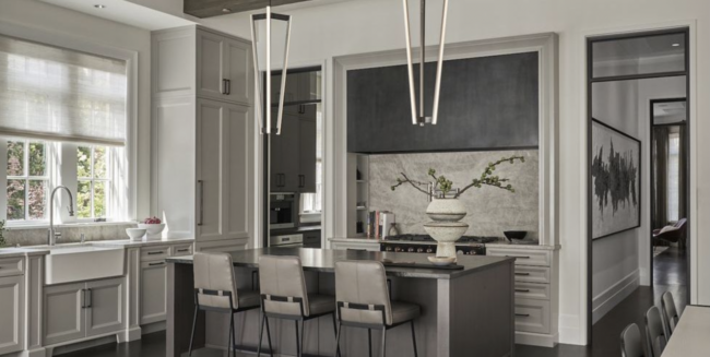
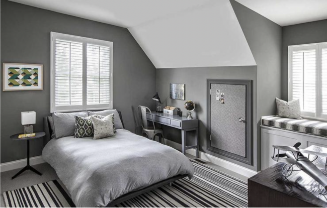
But they are just so…..depressing. I mean, how amazing would those rooms be if they just had some warmth and color?
If you love gray and the gray trend don’t take this personally…I’m sure you’re super cool, and we would have a great time if we hung out. I could tell you over drinks how much I hate gray, and you could tell me how much you hate blue and green, and then we would laugh and talk about how we both fed our kids cereal for dinner and haven’t shaved our legs in weeks.
Ok, now moving on but still not getting to the topic of the post…let’s take a quick trip down memory lane and talk about the main interior color of houses past.
Once upon a time, in 2009…
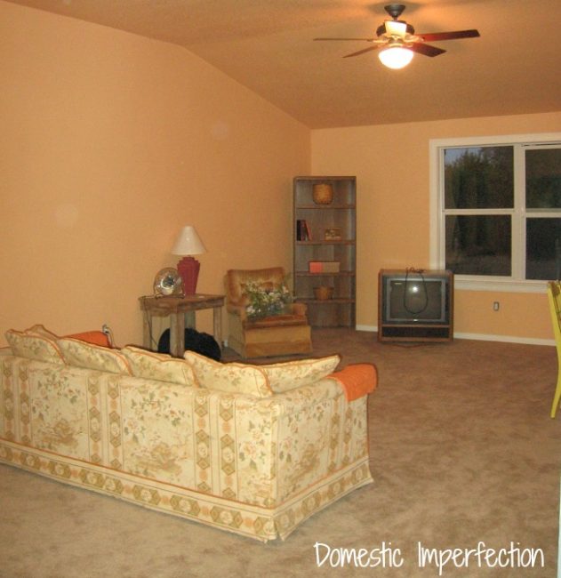
In my first house, I repainted my living room three full freaking times because I couldn’t get the color right. I had so many samples and so many gallons of paint, and green is hard, and eventually, I got frustrated and dumped everything I had into a five-gallon bucket and just used that. This was the result.
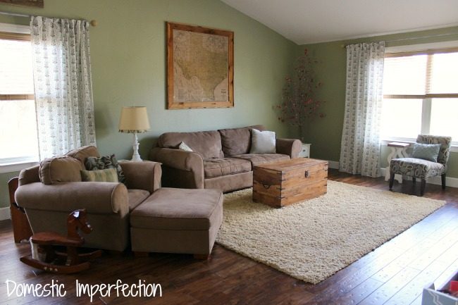
It actually turned out well, and I loved the color…but heaven forbid I need to do a touch-up.
I look at that photo now and cringe at so many things. The furniture…the rug…that DIY ruffle lamp. Decorating your home is a journey, styles are constantly changing, and so are you. Cringing is normal and is a sign of growth, and growth is good.
Also, I may cringe at that picture now, but it’s so much better than before. Progress is progress.
And then, in 2016…
In my next house, I tried a boatload of interior paint samples, because I didn’t really have a clear idea of what I wanted. Which is fine, but stressful.

Eventually I settled on Shoji White by Sherwin Williams, which is a dark warm white and a great color. 100% recommended.
Then in 2023…
Now I’m building my life 2.0 house, and here I am picking another allover interior house color. I’m better at it now and know what I want, so there’s no need to buy 27 paint samples.
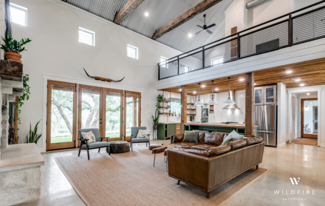
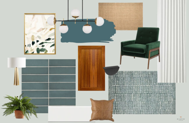
I know I want to fill this house with color, but I want the color on the walls to play a supporting role and not be the main character. I already have two main characters, and the wall color has to be something that takes a backseat to their noisiness.
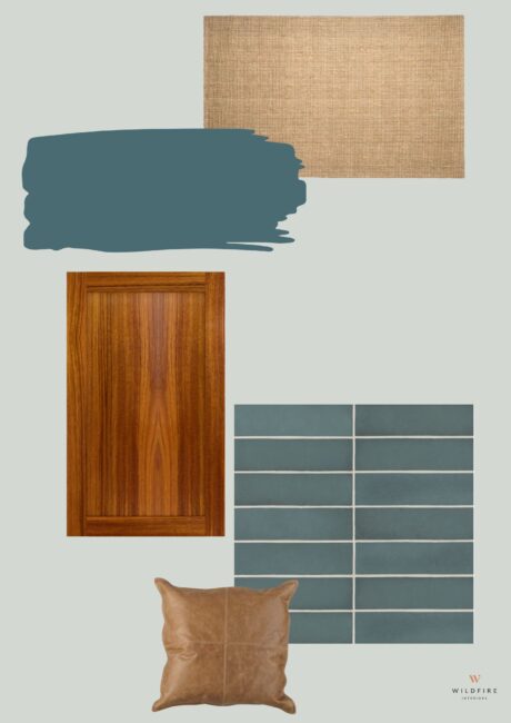
The first main character is my exterior paint color, Sophisticated Teal by Behr.
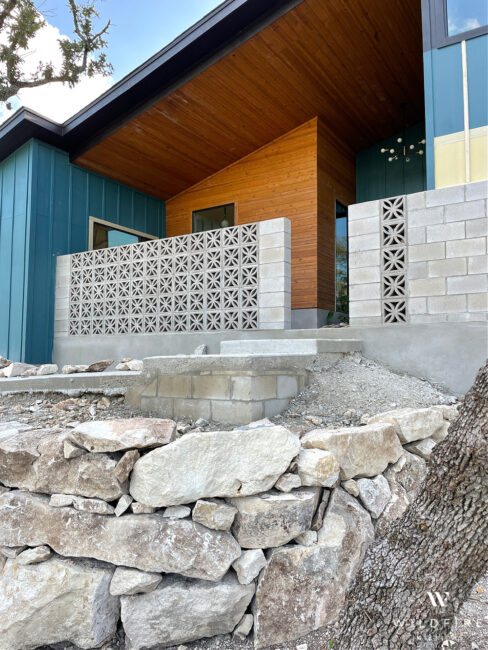
It’s an attention-grabbing paint color, and I have a lot of windows, so you definitely see it from the inside.
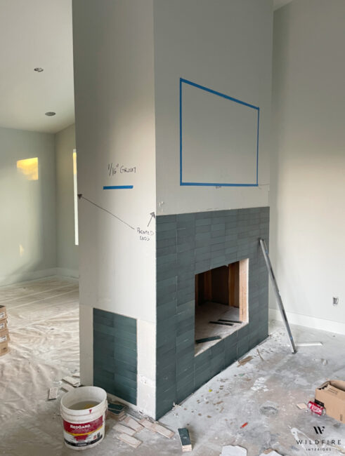
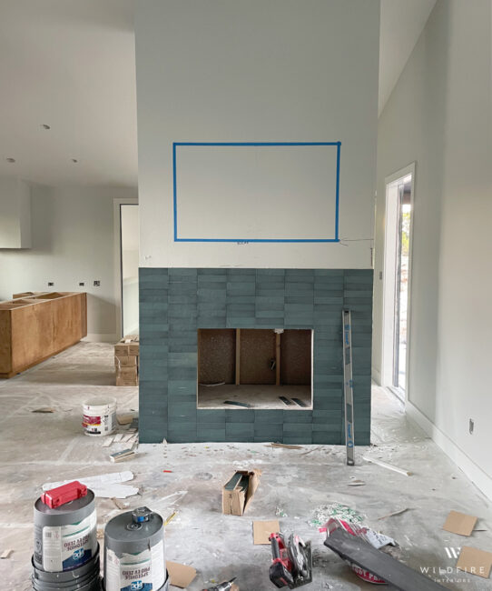
Second is the fireplace tile. It’s a teal blue as well and demands attention.
Whatever paint color I chose for the interior needs to complement these two things so that the space feels cohesive, which means I was looking for a light neutral color that has cool undertones. So…gray. Wonderful.
Here’s the thing about gray though, is it covers a wide variety of colors. Just do a web search for”gray paint,” and you come up with images like this…
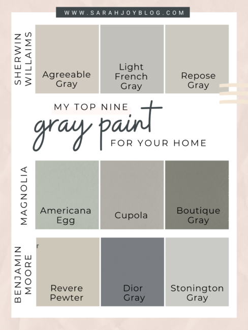
Those are all gray, and all very different.
To find my perfect shade of gray, literally googled “light neutral paint color with blue-green undertones,” looked at some photos online, and chose to get a sample of Wickham Gray by Benjamin Moore. 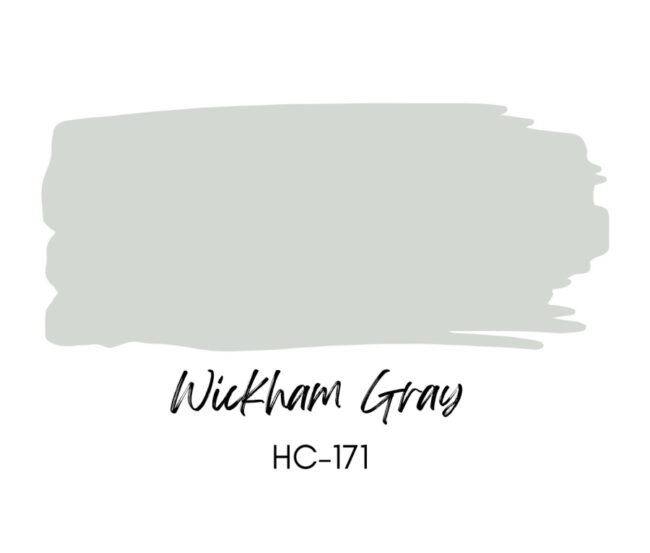 Articles about Wickham Gray –
And that’s it… that’s the only sample I got. I didn’t cover my wall in 17 sample stripes. I didn’t agonize over it…I knew what I wanted, even if I wasn’t really excited about what I wanted.
Here is Wickham Gray in the sample pot, looking all gray and stupid and perfect.

…and then on the wall, looking very cold and gray and boring.

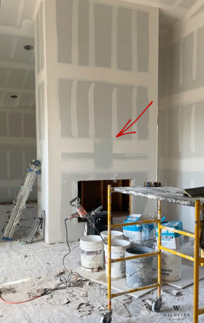
But I know boring means easy to decorate around later, and having cool and light walls will make the whole interior feel cohesive.

And then you take those cohesive cool elements, add in some warm elements, and watch it come to life…
And then, you just keep going.
And so….having said all that, here are my gray walls.

And also, cabinets! More on that in another post.
Here is the view from the kitchen into the living and dining room. So bland, but it looks like a house up in here!

Here is a sneak peek of the tile going up. This picture gives you a pretty good feel of what the color really looks like, a cool white in bright light, and a light teal gray in the shadows.
This view below gets me the most excited because you can really see the elements starting to come together.
Also, here is a one-minute video version of this post –
A little more information –
The paint is an eggshell finish, which is what I would always recommend using for walls. The trim is Sherwin Wiliams Pure White with a satin finish, and the ceilings are also Pure White but with a flat finish. The floors are covered with paper currently, but they are sealed concrete (not stained, just sealed). Sealed concrete isn’t my favorite option, but it was the most budget-friendly. And the cabinets are maple stained with Early American.
And there you have it, a long-winded post about choosing a paint color that I have always despised. And it was the right choice.
Next we are diving into designing the kitchen…stay tuned!
You may also like –
I love it!
I love it. Love it!
I’m not a fan of gray either. I understand why you chose your paint color and it does work.. I can’t wait for the warmth to kick in tho. It looks like you are using gold tones for your metal which helps a lot. And the green (my favorite color) looks great. I have always wanted sealed concrete floors. So easy with pets. It’s looking great!
It’s gonna be beautiful!! My preferred gray paint colors have warm undertones but the color you chose is perfect with the tile and outside house color and anything else you add! Can’t wait to see it all come together.
I’m with you on disliking gray and loving blues/greens/browns. So I very much appreciated your series of mood boards making the case for your perfect and horrible paint color!
Snorted out loud at your words about cringing and past choices. Yup. Same here!!! And. Ashley!! You have to do some something… crazy. Something that goes against everything your learned in school. Something that every designed out there warns your against. Something unique. Something unexpected. Something that is you, your boys, your family!!
I’m with you on gray! Who wants to live in a hospital or jail? YOUR gray is special though because it’s not JUST gray. You’re dressing it up and having it reach its full potential. ;-) Can’t wait to see it all done!! Cheers to Life 2.0!!
Too funny! I love grey but now that I’ve painted most of our Texas house’s rooms Comet Dust by Valspar, I think I need to add some color. We have a red sofa, darker and lighter wood furniture, large oak bookshelves. The grey will do exactly what yours is doing and recede.
I love the idea of the bamboo shades! I was going for a French look, too, which is why I chose grey. Anyway, happy finishing your home!! It looks lovely so far. <3
Hugs,
Barb :)
Love, love, love it! Can’t wait to see the final product!
I totally relate to your love-hate feelings about Wickham Gray! It’s such a tricky color—sometimes it feels too drab, yet somehow it perfectly sets the mood in other spaces. Your insights really resonated with me! Thanks for sharing your perspective!
I totally relate to your feelings about Wickham Gray! It’s such a tricky color—sometimes it feels too cold, yet in the right light, it can be just perfect. It’s maddening how it can change so much based on the time of day.
I totally get your mixed feelings about Wickham Gray! It’s such an interesting color; it can feel overly cool at times, but when paired correctly, it really brings a stunning elegance to a space. I find it hard to love and hate at the same time! Thanks for sharing your take on it!