
How to Choose a Paint Color (VIDEO)
Choosing a paint color for your walls isn’t easy. There are just SO MANY options, and narrowing it down can be overwhelming and even a bit paralyzing. Somehow you have to pick just one, and have it not look like hot garbage on your wall.
So how do you do it? How do you choose a wall color for your interior? Like anything, if you break it down into baby steps, choosing a paint color isn’t that scary or difficult.
HOW TO CHOOSE A WALL COLOR (and get it right the first time!)
Below is a video version of this post. It’s 6:25 minutes long and covers all three tips for selecting a wall color. Enjoy!
In this post contains three tips on how to choose a paint color with confidence. One tip will help you understand paint colors better, one will inspire you, and one is something you should NEVER do when choosing a color.
So let’s get to it!
1. Decide how you want the room to FEEL
(A.K.A – a crash course in color theory)
Let’s say you just moved into your first home. You’re standing in your new living room, feeling excited and overwhelmed all at once. It has white walls and wood flooring. You didn’t bring any of your old furniture because it was all hand-me-downs, which was great in your college apartment but has no place in your new home. You’re ready to start decorating, but have no idea where to start.
Start by asking yourself how you want the room to feel. Do you want your space to be energetic or calming? Don’t overthink this, just answer with whatever your gut tells you.
Look at the two images below…which one would you rather hang out in?
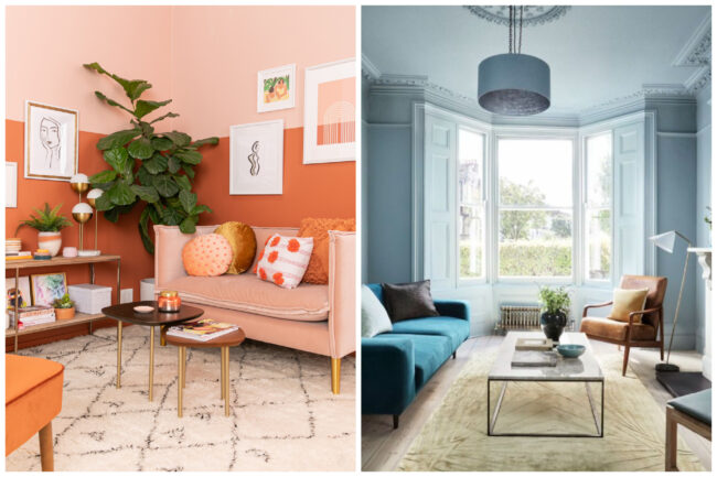
Here is another way of wording the question that might make it easier to answer – How do you WANT to feel when you are in the space?
BASIC COLOR THEORY – THERE ARE ONLY SEVEN COLORS
You see, there may be thousands of paint colors to choose from, but if you strip it down to the basics, there are only seven colors.
That’s right, just seven. That doesn’t sound so scary, right? You can choose from seven colors.
The seven basic colors are the ones you find in the rainbow, the ones in the acronym ROYGBIV
- R – Red
- O – Orange
- Y- Yellow
- G – Green
- B – Blue
- I – Indigo
- V – Violet
You can further break these colors down into two categories – warm colors and cool colors.
WARM COLORS VS. COOL COLORS
Colors have the ability to to evoke emotions, and the color that you choose to surround yourself with matters. Warm colors will bring on feelings of energy and playfulness, while cool colors make a space feel soothing and calm.
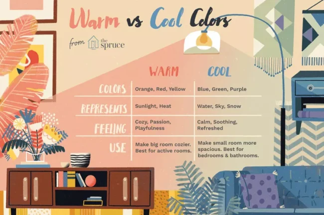 Image Source – Understanding warm vs. cool colors – The Spruce
- Warm colors – Red, Orange, Yellow
- Cool colors – Green, Blue, Indigo, Violet
(although yellow-greens and pink-purples can get a little complicated)
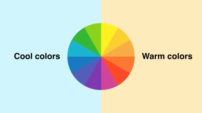 Image source – Everything you need to know about color – Monica Galvan
Let’s practice identifying warm vs. cool rooms so you can get a better sense of what you want for your space . We’ll start simple.
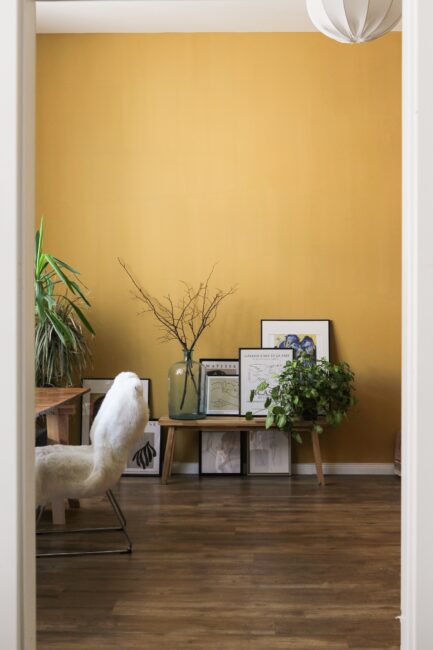
WARM – This room is a bold yellow, so the mood is happy and energetic.
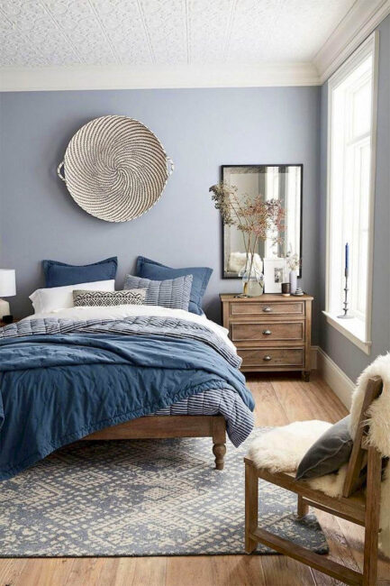
COOL – This room is blue, which makes it feel peaceful and calming.
Ok, now let’s make it slightly harder –
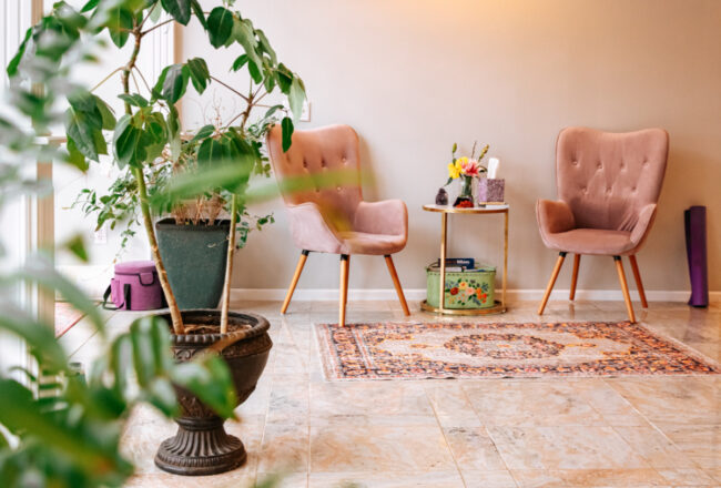
WARM – this room is pink, and gives off a sophisticated playful vibe.
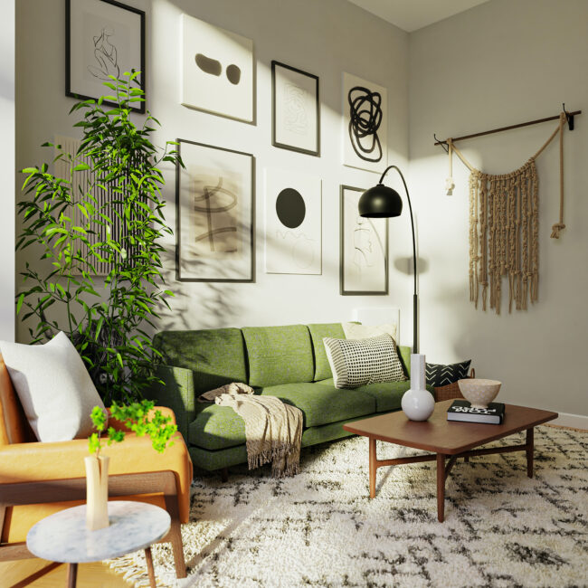
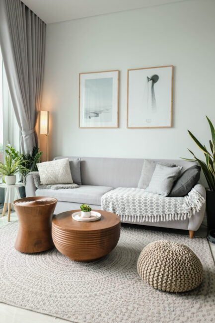
COOL – The wall color here is a green-gray, and the room feels soothing and relaxed.
Now let’s turn the difficulty up a notch.
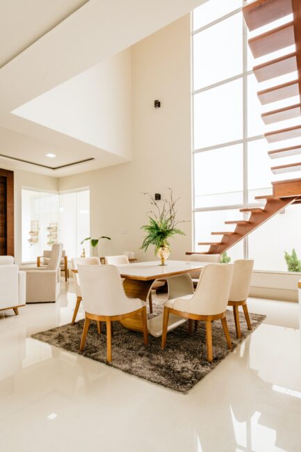
The room below, is it warm or cool?
It’s calm, it’s neutral, and it’s mostly white. White like somewhere snowy. Snow is cold (this is how my brain works). But this room has a warm paint color. If you are unsure about the undertone of a paint color, look at it where it is darkest, like in the shadows. See it in the corner on the upper left? This white paint color has a pinkish-beige undertone, which is warm.
Here is another example. The undertones are subtle, but this white paint color has yellow undertones (cream), which puts it in the warm category.
On the flip side, here is another “white” paint color. This one has a blue-ish green undertone, which makes it cool.
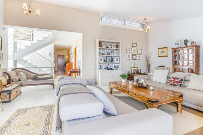
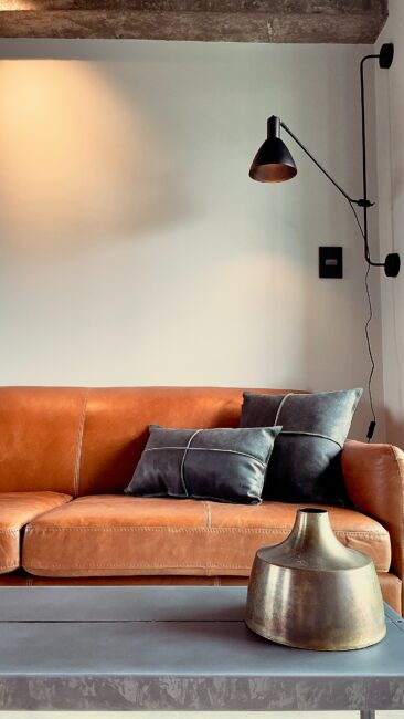
One last example. This room has warm elements (the sofa, the vase, the beam), but look at the paint color behind the sconce. This white gray paint color has blue undertones, making this a cool room.
Knowing that there are only really seven colors, and then deciding if you want a warm or cool space should narrow it down to a manageable amount of color choices.
PUT YOUR KNOWLEDGE INTO ACTION
Say you want a warm paint color, but something subtle and neutral.
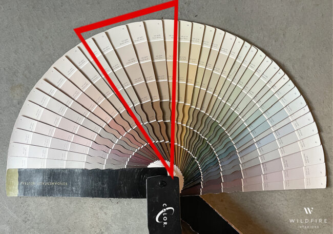
Here is every color in the neutral category on the Sherwin-Williams fan deck. As you can see, neutrals can be quite colorful.
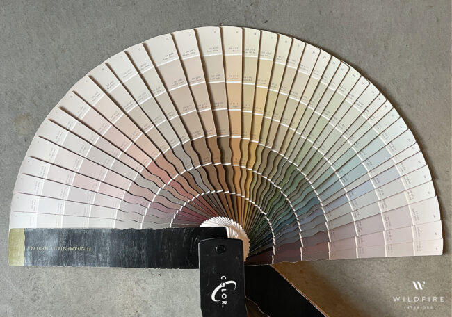
All the colors on the outside of the circle look pretty much the same…they are all white. This is where the undertones will get you and why white is by far the most complicated color. White is never just white.
TIP – If you want to know the undertone of a color, look at the darkest color on its color strip.
Also note, the colors are in ROYGBIV order, from left to right. So if you want a warm neutral, you will want to only look on the left (the red, orange, yellow) side of this semi-circle.
Say you instantly eliminate the ones with pink and yellow undertones. You want a pure, warm neutral, which means the ones inside this red triangle are your only options.
From there you just have to choose how saturated you want the color to be (how light or dark). Go ahead and so pick three or four colors within that slice that you want to sample on your wall. Or pick a dozen…it’s up to you. Then head on over to Samplize, put in your order, and they will be on your doorstep the next day. Boom. Easy.
Want to buy a fan deck? You can ask at the store, or buy them on Amazon. Click here for Sherwin Willimas and here for Benjamin Moore.
2. PULL A COLOR (AND CREATE A PALETTE) FROM AN ITEM YOU LOVE
If you are still feeling a little lost, I have another tip.
Find an item you love and use it as inspiration for your room. It can be anything… a rug, a piece of art, a piece of clothing, the cover of a book. It doesn’t even need to be something actually own you are going to use in the room (though that does help). There are no rules, just pick something that makes your heart sing.
Next you are going to take that thing and create your color palette from it. For example, say you cant get enough of the Multi Victoria Medallion Washable Area Rug from RugsUSA.

Take a screenshot of it, and head over to the Colorsnap tool from Sherwin Williams. Upload the photo you just took and BOOM. Instant color palette.
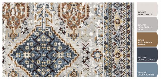
This tool is awesome and I could play with it all day. It can actually give you up to ten colors, so you have some freedom in the color palette you choose.
You should choose THREE colors to use in your room. For the rug above, they would be gray, blue and orange. You can use variations of those colors to add interest, but stick with just three (don’t count white, that one is a freebie).
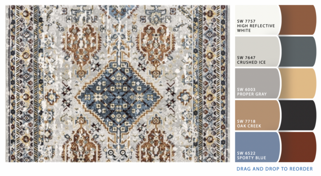
I uploaded this picture twice and got a slightly different result each time, so it’s not foolproof….you will still need to get paint samples and try them out in your space before making a decision. It’s a great tool though, and perfect for giving you a jumping-off point.
Ok, one more time just for fun. Let’s try it on this piece of art from Minted, which has been whimsically named “Cool Abstract Botanical 1“.
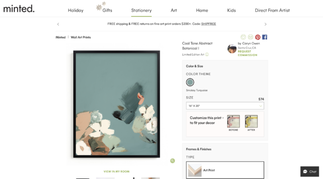
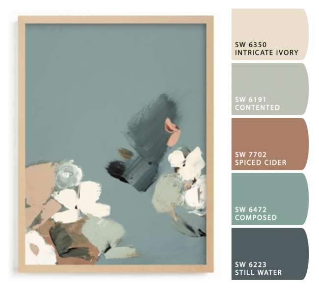
With the above color palette, you could choose to make the space either warm or cool. If you want a warm room, put Intricate Ivory or Spiced Cider on the walls, and then accent with the blues. For a cool room, paint the walls in either Contented, Composed, or Still Water and accent with the warm colors. (Or don’t…you could just pull the blues for a monochromatic look as well.)
Now it’s time to talk about the thing you should never, ever, ever do when choosing a paint color.
3. NEVER PICK YOUR PAINT COLOR IN THE STORE
Just say no to picking colors on a whim under the fluorescent lights of the paint store. It’s a terrible idea and a surefire way to be unhappy with the final result. And don’t even come at me by saying you will just look at a few sample cards in the parking lot (it’s natural light!) and then go back inside and buy a few gallons. Stop it. You’re better than that.
Don’t ever pick a paint color because it looks good online. Don’t pick a paint color because it looks great in your best friend’s house. Use the above methods, get yourself some samples (big ones, no taping the paint chip to the wall), put them in your space, move them around, and study them for a minimum of 24 hours before making a decision. Paint colors look different depending on the time of day, so you need study them in the morning, afternoon, evening, and artificial light before choosing a final color. Light also changes based on the way direction a room is facing…you could love a paint color in your bedroom and despise it in your dining room.
Choosing the wrong paint color isn’t the end of the world. Relatively speaking, paint is pretty much the cheapest change you can make to your home. But painting a room is also kind of a pain. You don’t want to do it twice. And if you are paying someone else to do it, that ain’t cheap. So let’s move slowly, not rush the decision, and get it right the first time.
A few other tips –
- If you’ve taken time and carefully selected your paint color, don’t freak out and claim you hate it until it you have decorated the room. It will come together, it’s just a big change in a torn apart room. Trust yourself and trust the process.
- Make sure you get the sheen right. I always recommend eggshell, it’s fairly matte without having the scrubabiltiy issues (as in you can’t clean it…made this mistake before) that flat paint has. Satin is also acceptable if you want a little shine and more cleanability.
- If you want to paint your room a bold color, do it, but don’t pick a color that looks like it came out of a box of crayons. Always go greyer than you think you should…I promise it will look very bold once it’s up.
- Use Samplize! Order all the peel-and-stick paint samples you want, and they will arrive the very next day. They come in large sheets that you can reuse, move around, and don’t take up storage space.
- When trying out your paint samples, put them them in front of a white poster board (or paint the samples directly onto the poster board) so that the current wall color doesn’t interfere with the sample.
And there you have it. Put any question you have in the comments, and happy painting!
So much great info! I recently moved into my house and want to redo the living room. I’m bookmarking this to come back to when I’m ready to start looking at paint colors. :)
These are great tips, thank you!
Thank You so much for the informative video. I now look at colors and rooms differently. This article has inspired me to tackle my Daughters room
Amazing post — thank you! What I thought I already knew, I only knew part of. We’re in the midst of a master bath/bedroom remodel and I will definitely be using your tutorial to choose my colors!
This was an amazing post! I feel like I almost finally grasp the whole warm-cool color tone thing–I just need to reread that section a few more times. ;) Thank you for posting this. It was hugely helpful!
I’m so glad you found it helpful!
This was very helpful. I have been trying to decide what color palette to use in my home for a year now. .. not joking literally a year! The problem I’m running into is I have gray our kitchen cabinets, which read very blue right now with fantasy brown counters and Thassos white marble backsplash. I’ve read that if I want to hide the blue undertones and gray owl or the green undertones out by using wall color in the red orange family. However, I’m having a really hard time finding something that has enough contest with the cabinets and isn’t too dark. Any ideas?!? I have over 100 samples so I’m sure I have whatever color you recommend Benjamin Moore amd Sherman Williams.
Thank you from
The crazy paint lady lol
Oh also I’ve used two different interior color consultants and wasn’t confident in either!
I love that you mentioned to trust yourself and finish the project completely before hating it. I can tend to do that myself as a decorator but once I complete the whole look, it really does come together nicely.